
Brand identity
Art direction
Motion design
ToV & Messaging
Brand guidelines
Addison
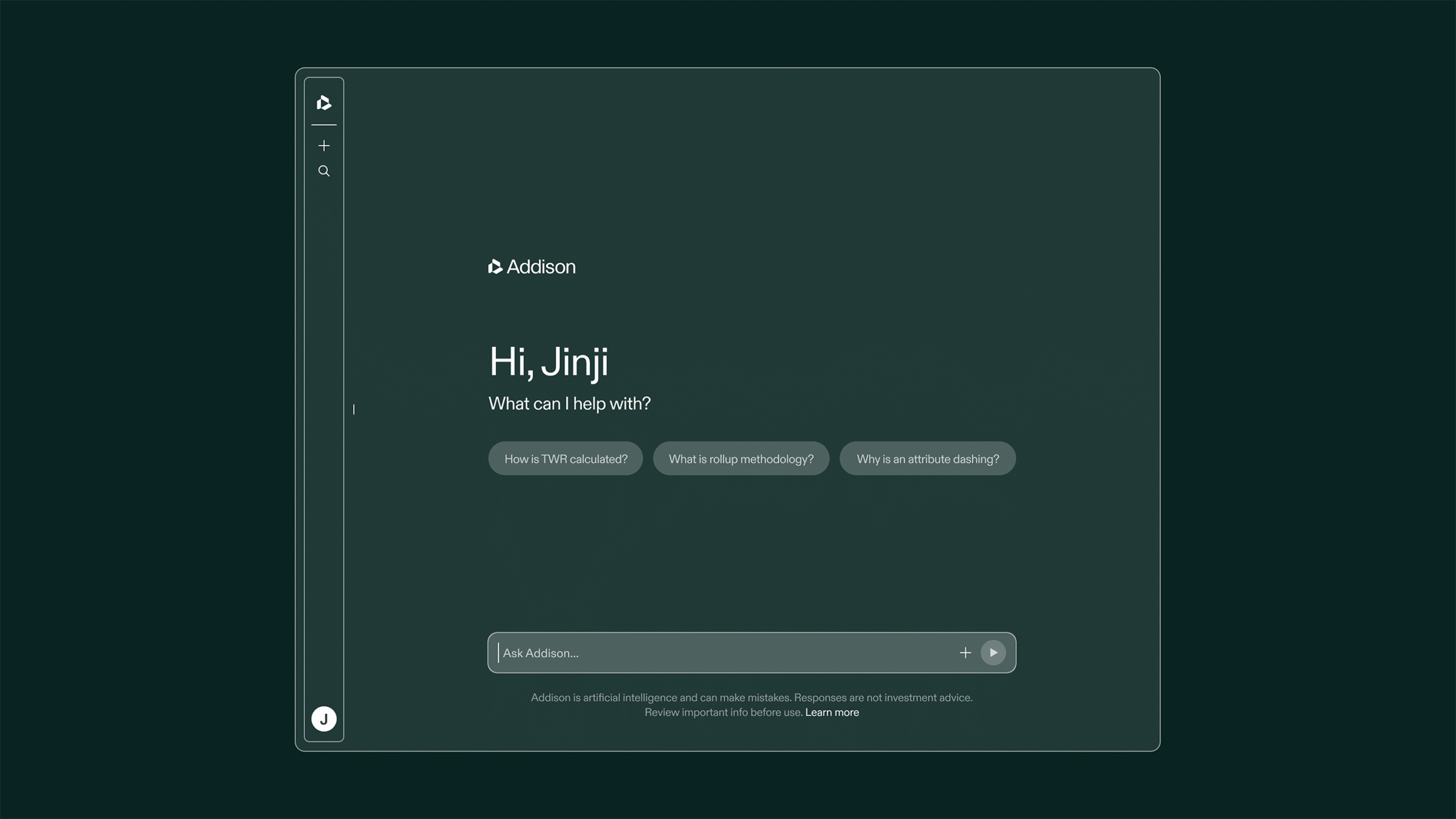
Addepar was built on a simple premise: the right data at the right moment is what separates good decisions from better ones. The platform gives advisors a complete view of their clients' portfolios and the intelligence to act on it. Addison is an extension of that intelligence. As a new native AI experience embedded within the platform, Addison helps investment professionals cut through complexity and get to what matters faster.
Addepar partnered with CōLab to build a brand for Addison that was distinct enough to signal a breakthrough in financial technology, yet close enough to the parent brand to carry the same credibility. The challenge was balancing the power of Addepar with the accessibility of Addison to craft an identity that mirrors the product experience.
By grounding the brief in its core promise of turning complexity into clarity, we crafted an identity that positions Addison as a trusted guide helping users fully unlock the power of Addepar. The brand communicates ease in the face of complexity, reinforces Addison’s connection to Addepar’s rigorous data foundation, and signals a new, elevated standard for AI‑driven financial insight. The result is a visual identity that reflects the power and intelligence of Addepar but remains warm enough that it never feels like something you have to work to understand.



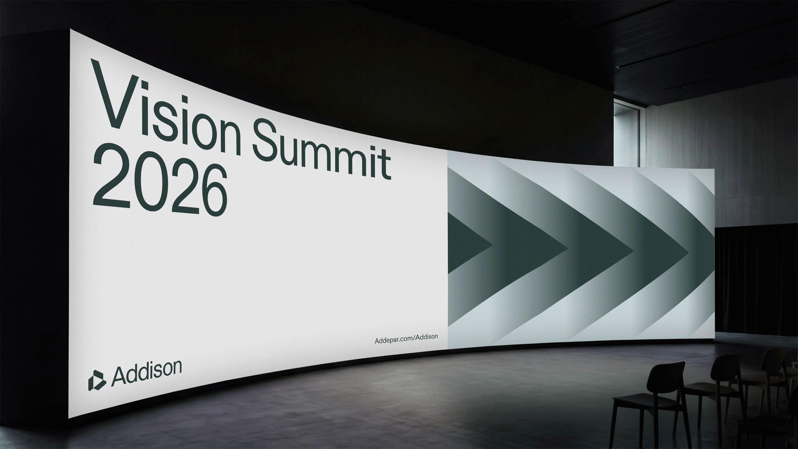

Logo & Brand Design
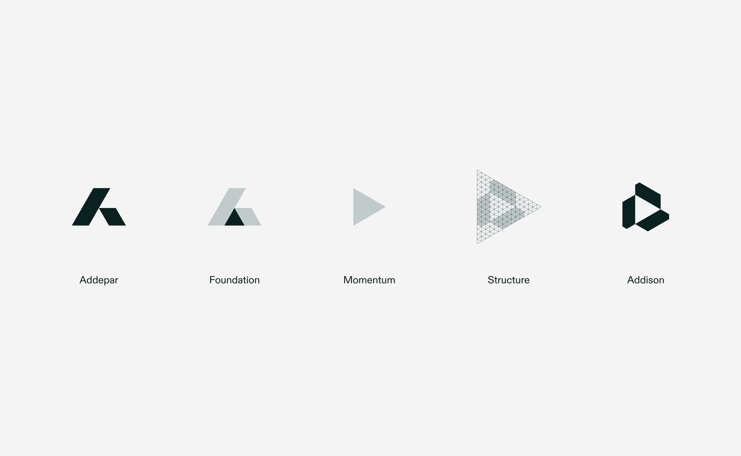
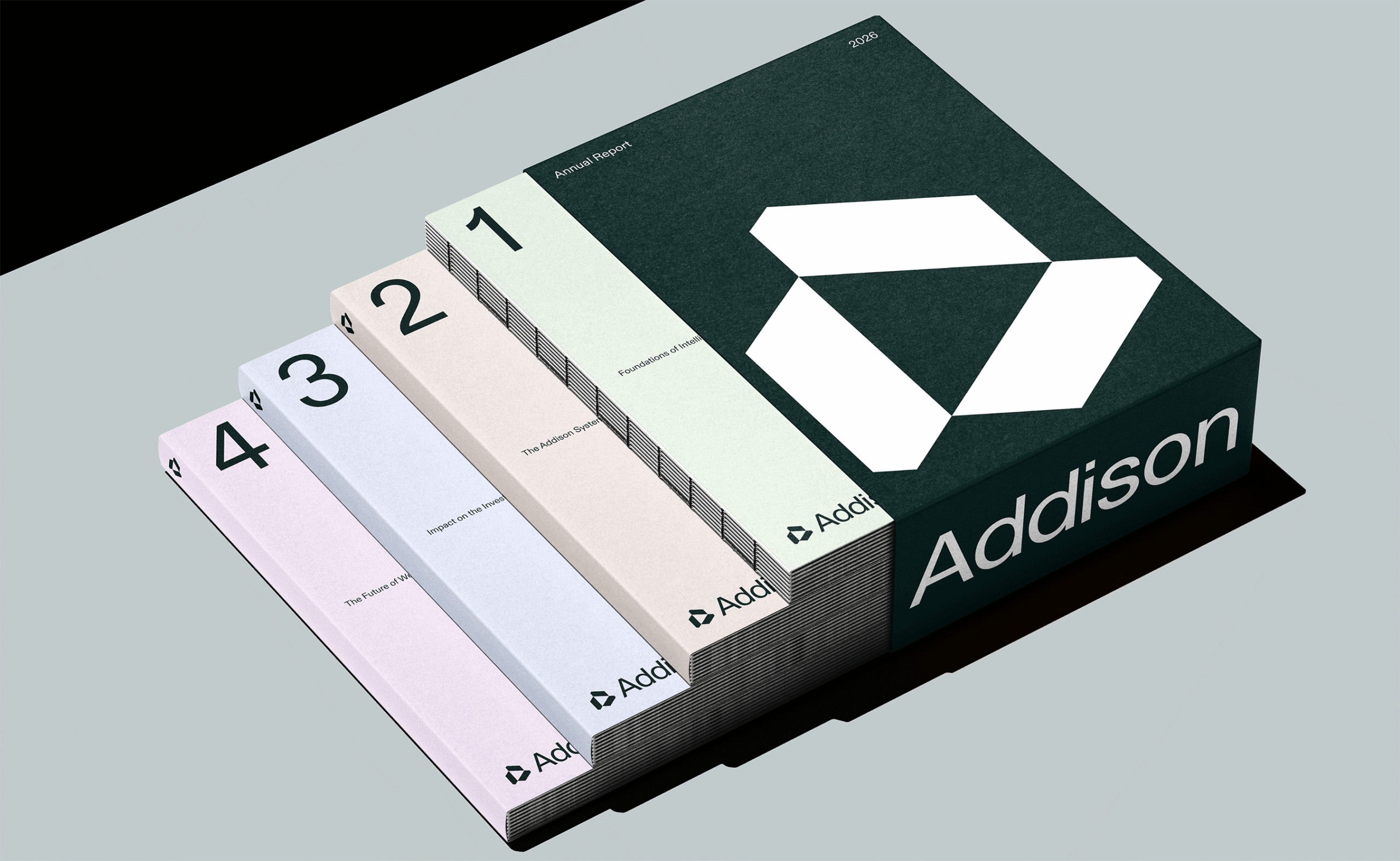
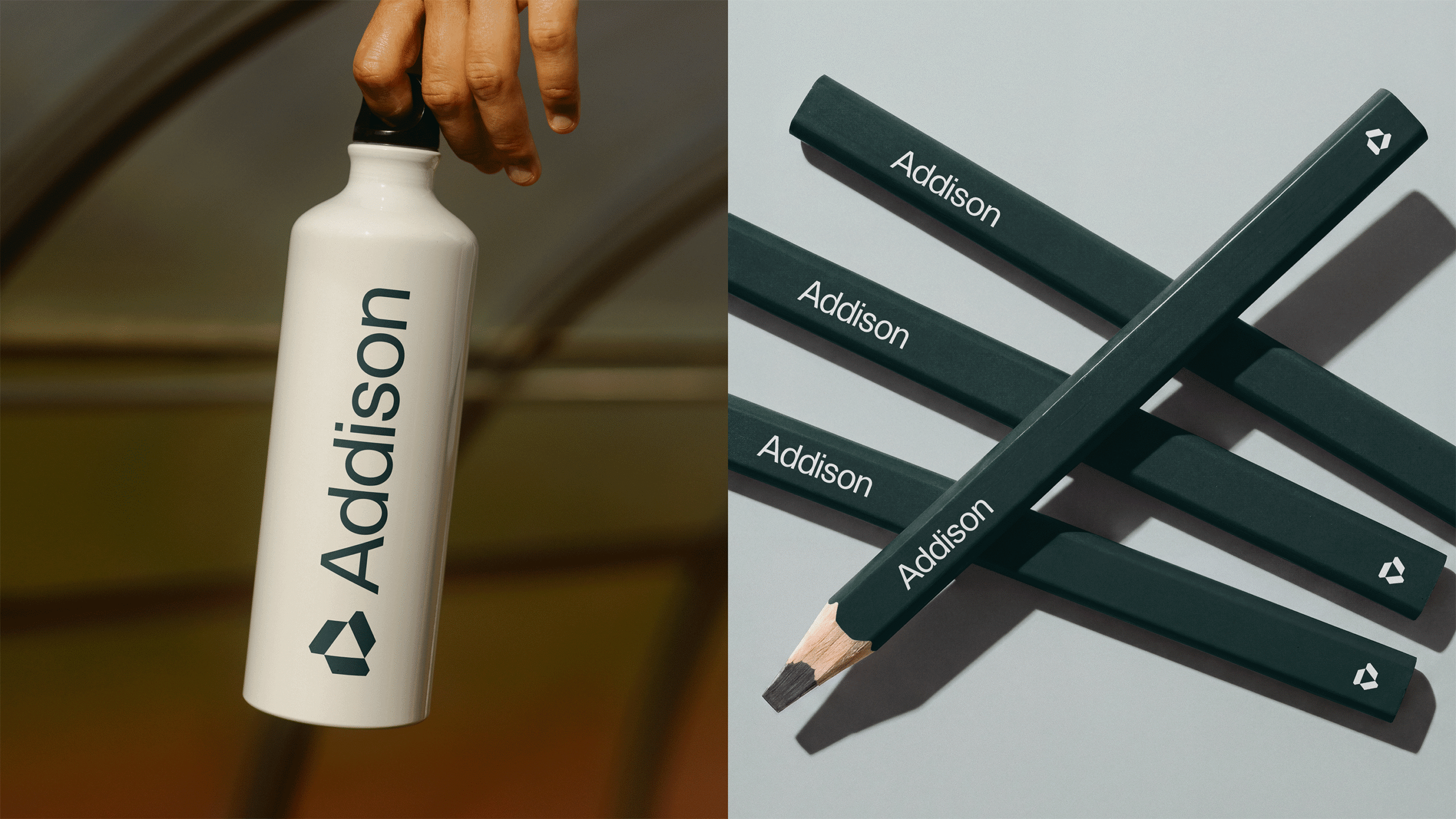
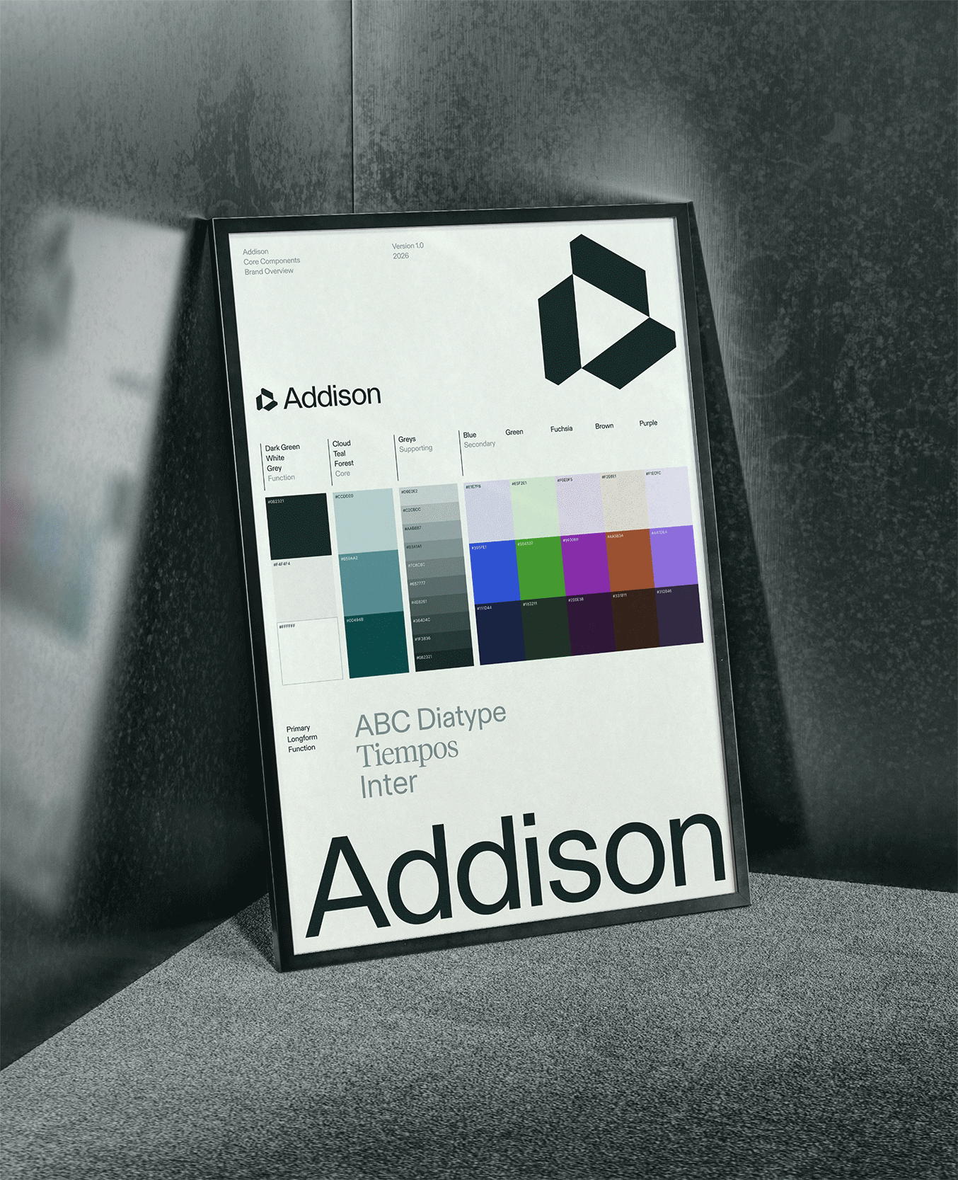
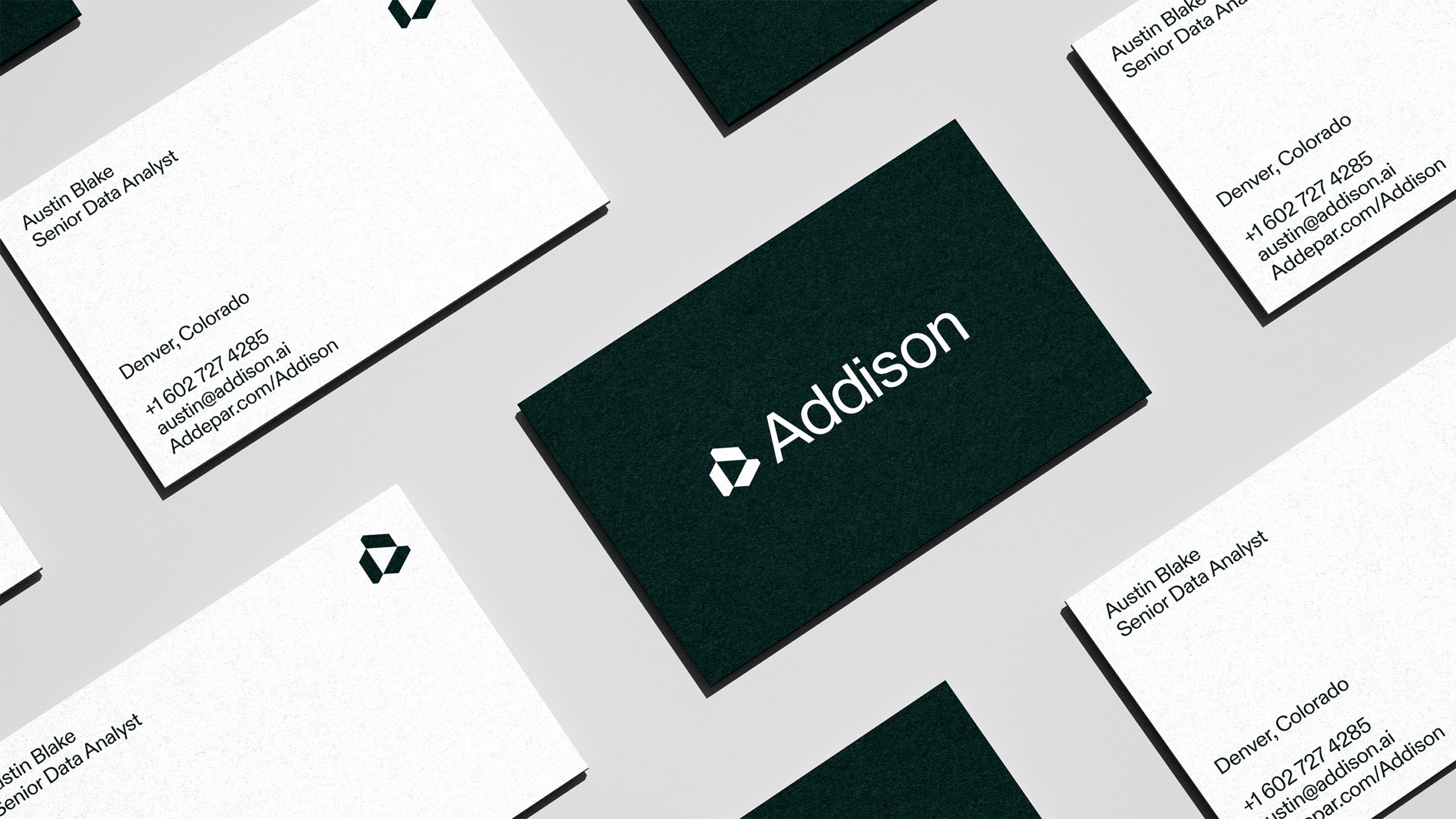
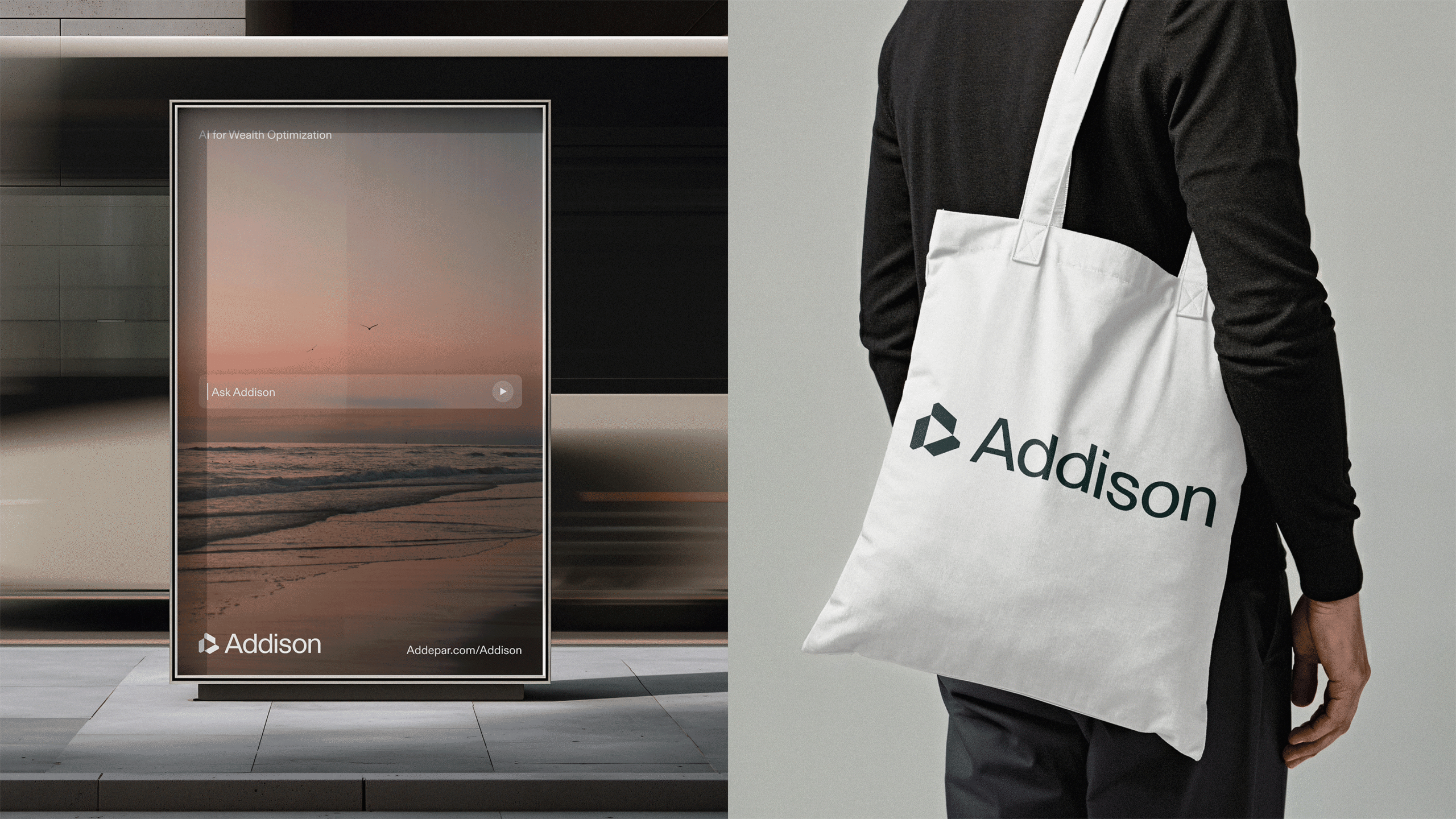
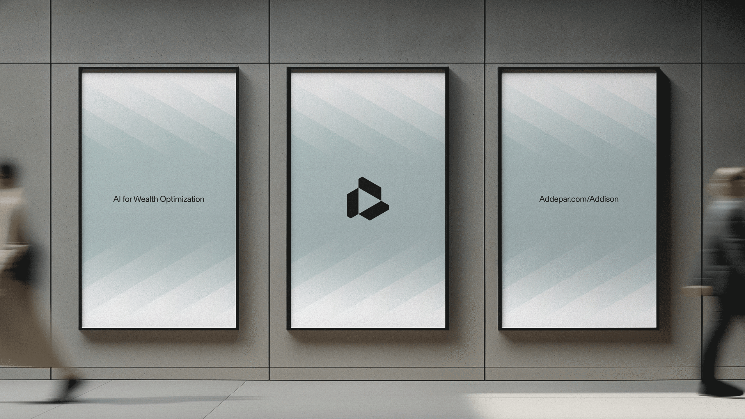
The Addison mark begins where Addepar's does — a shared triangular foundation built on structure, rigor, and forward momentum. From there, we refined and simplified, creating a glyph that feels distinctly its own: clean, optimized for product interfaces, and designed to scale gracefully from a tiny icon to a full brand expression. It's a mark that doesn't announce itself. It just works.
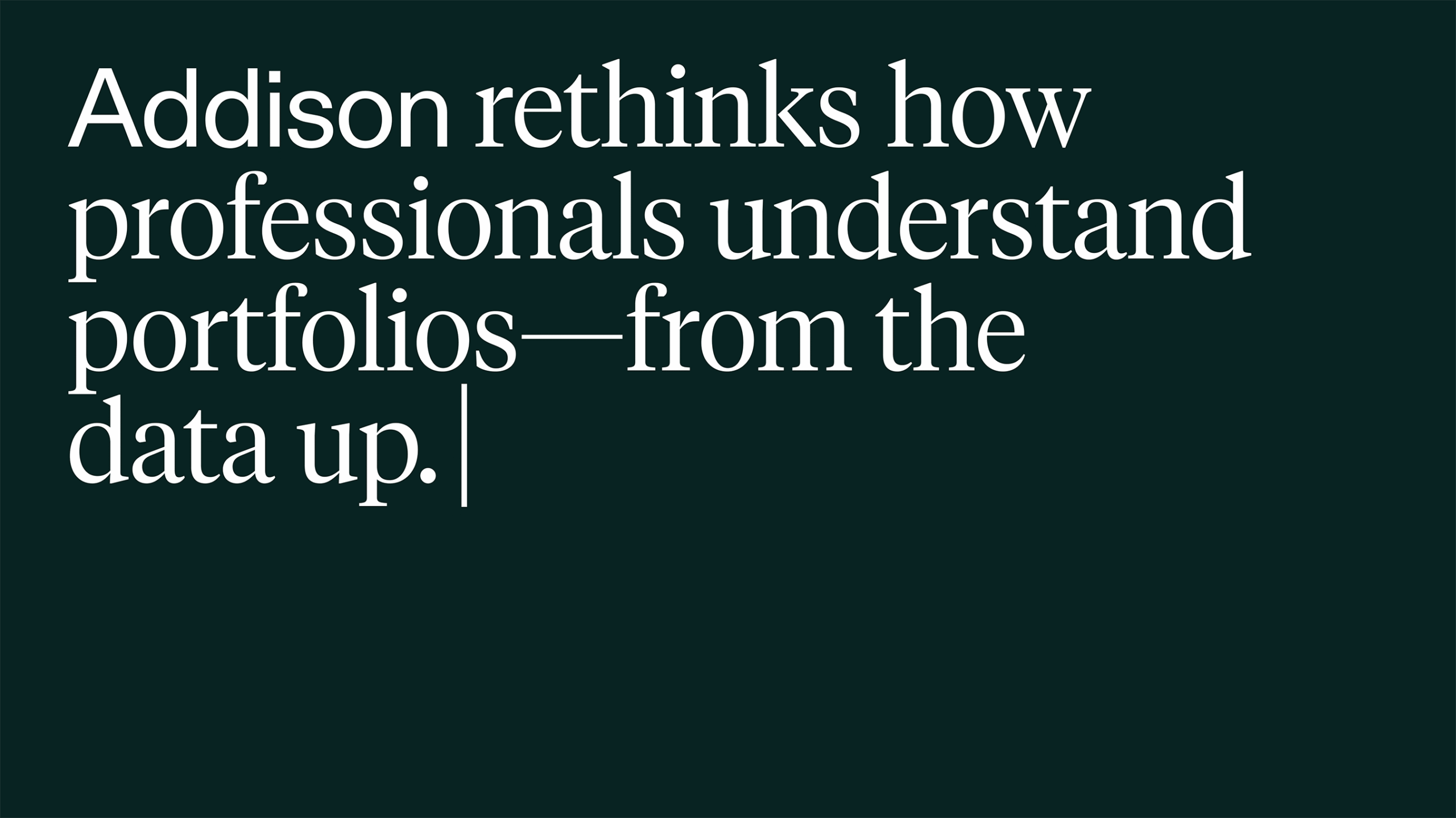
Typography was chosen to hold both sides of Addison's character. ABC Diatype brings a modern, engineered precision. Tiempos brings warmth and editorial humanity. Together, they say: this tool thinks deeply and speaks plainly. The color system grows from Addepar's existing palette, extending it with softer tints and richer darks to support depth, hierarchy, and a more elevated product experience.
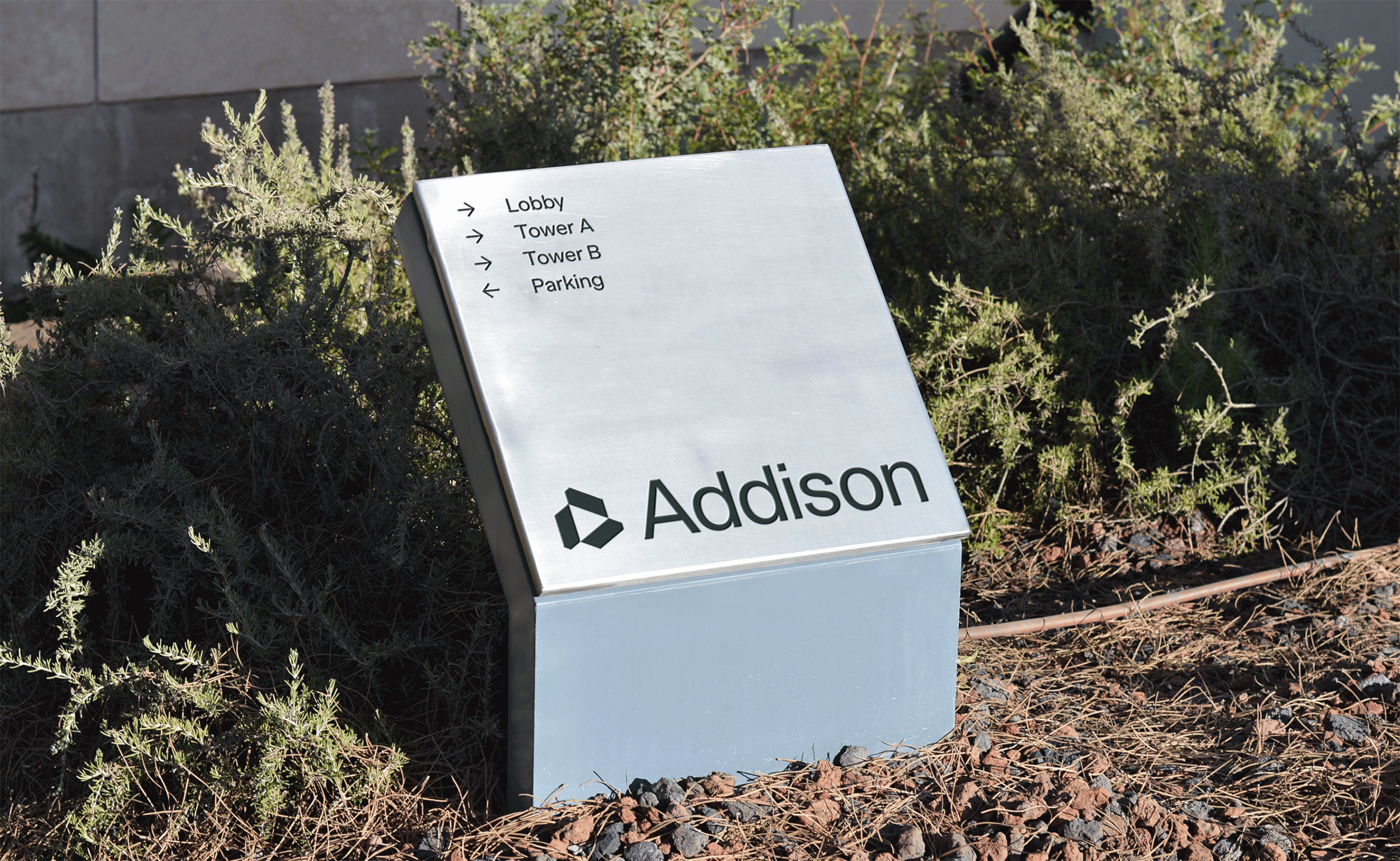
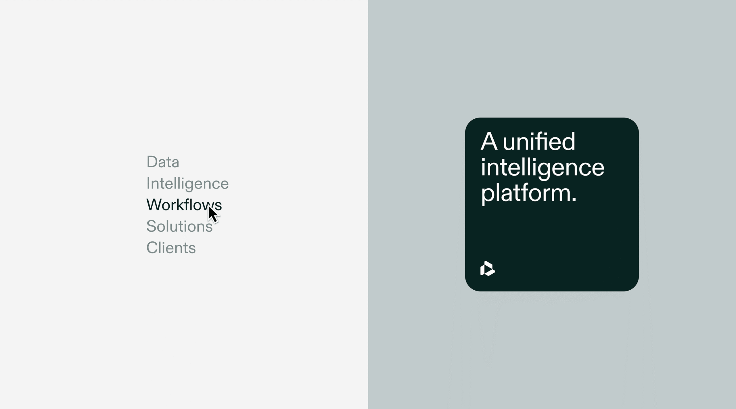

Visual System
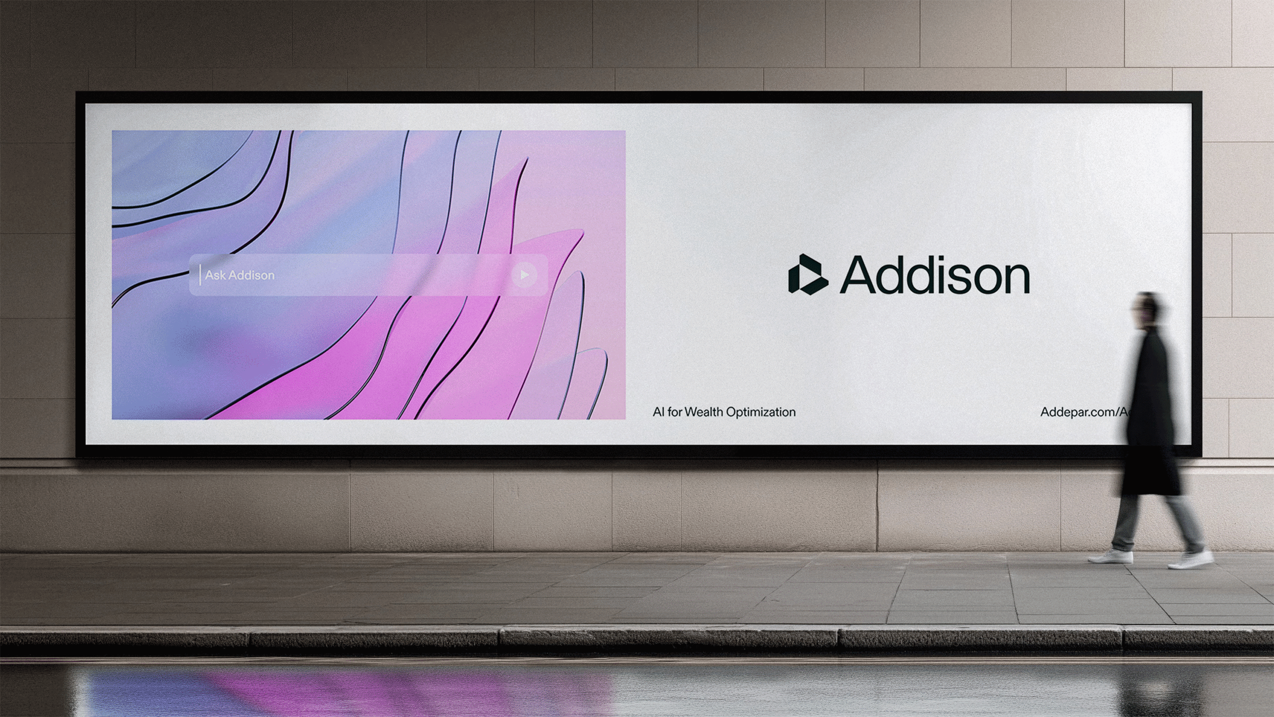
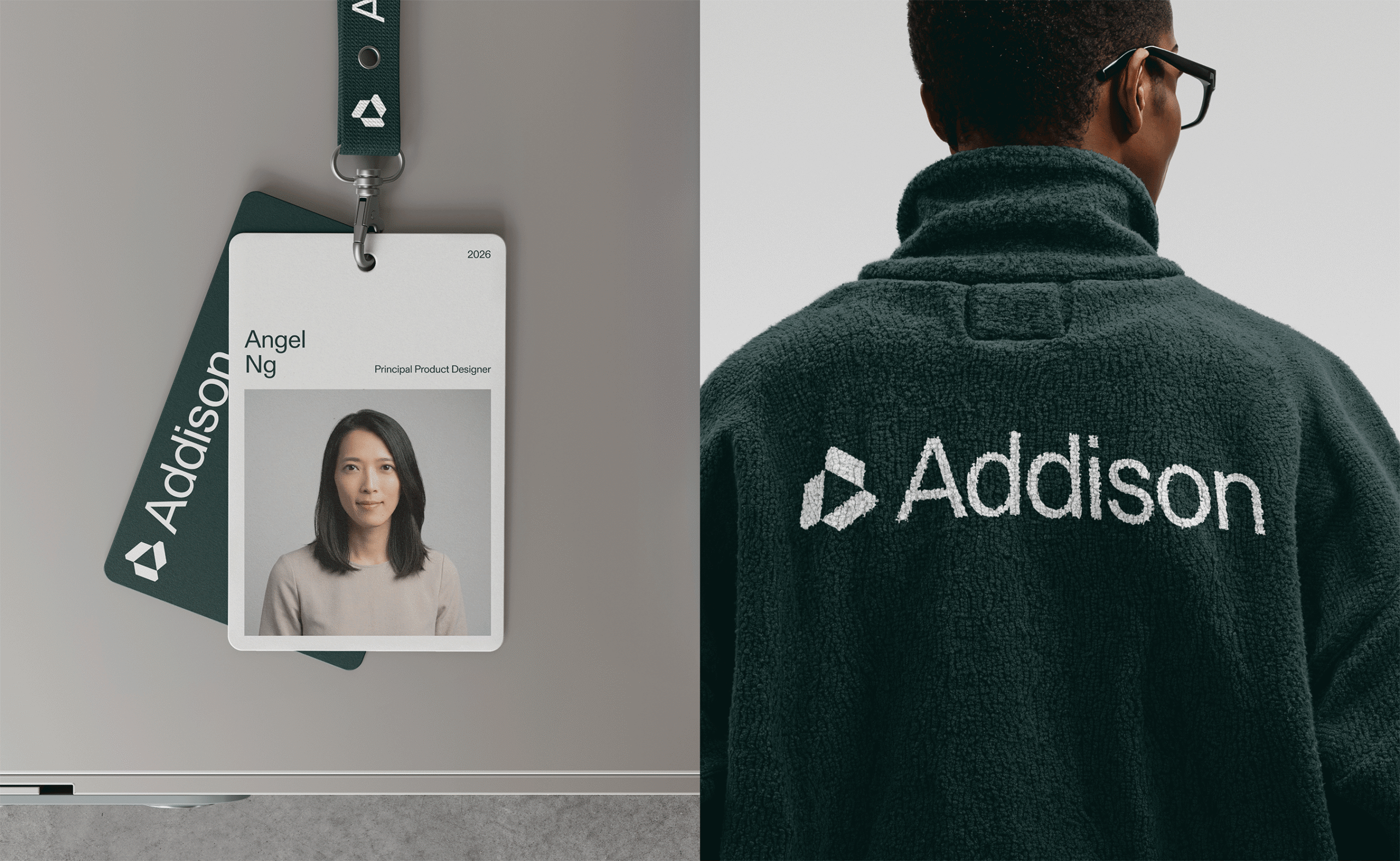
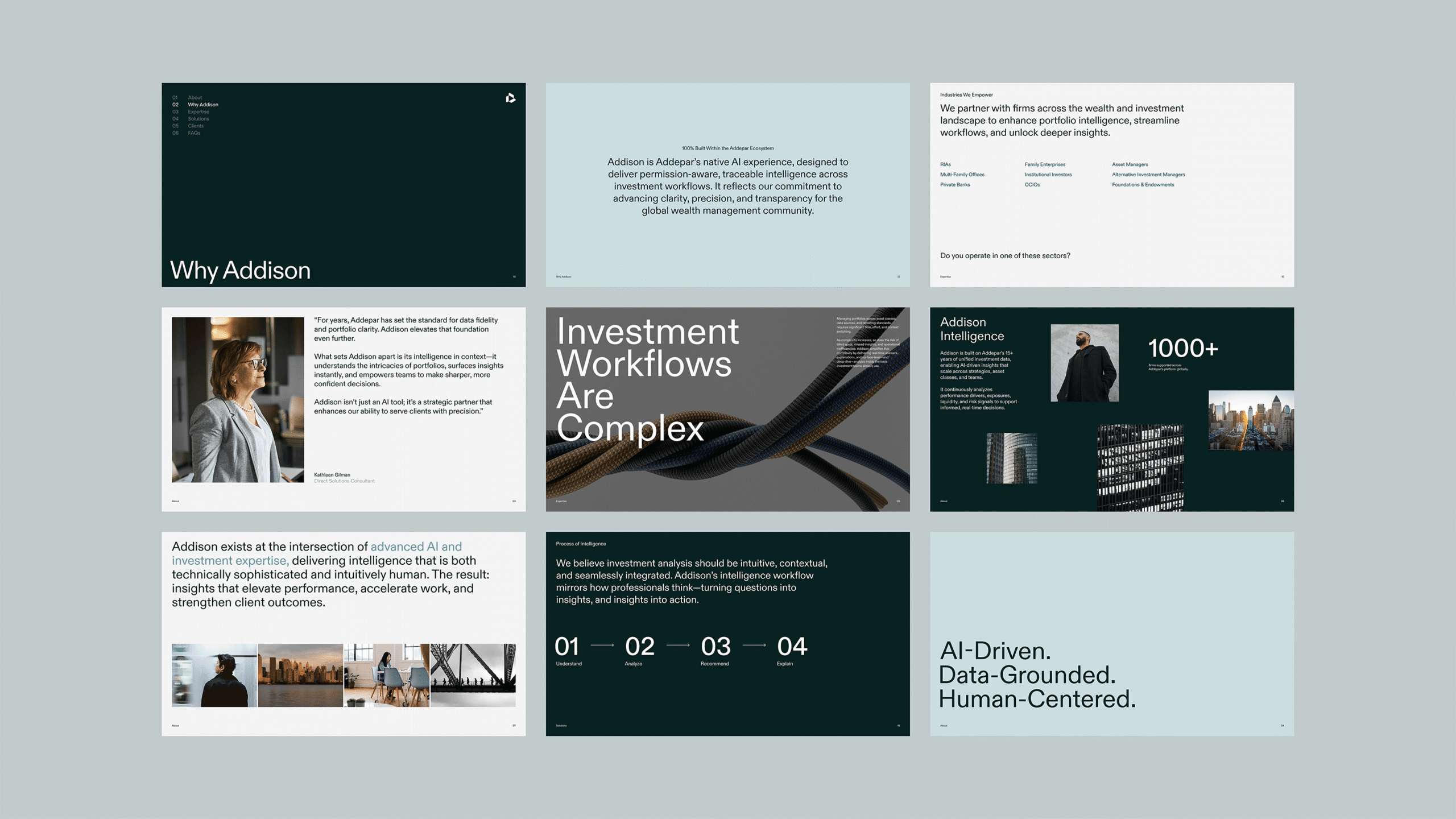
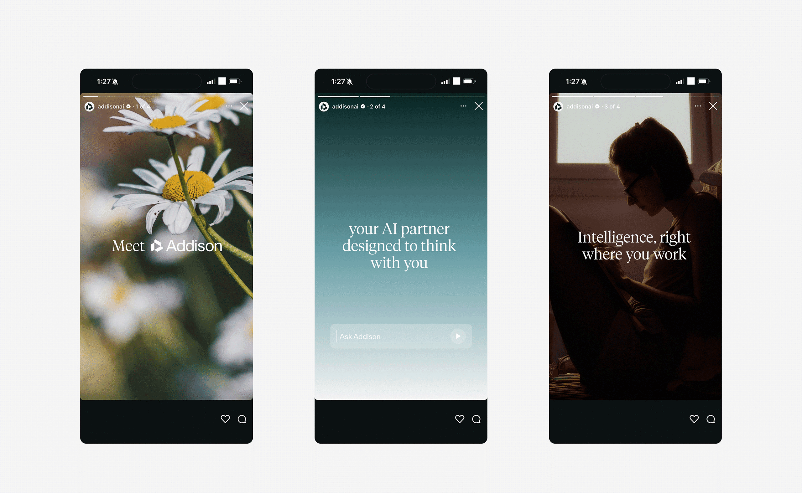
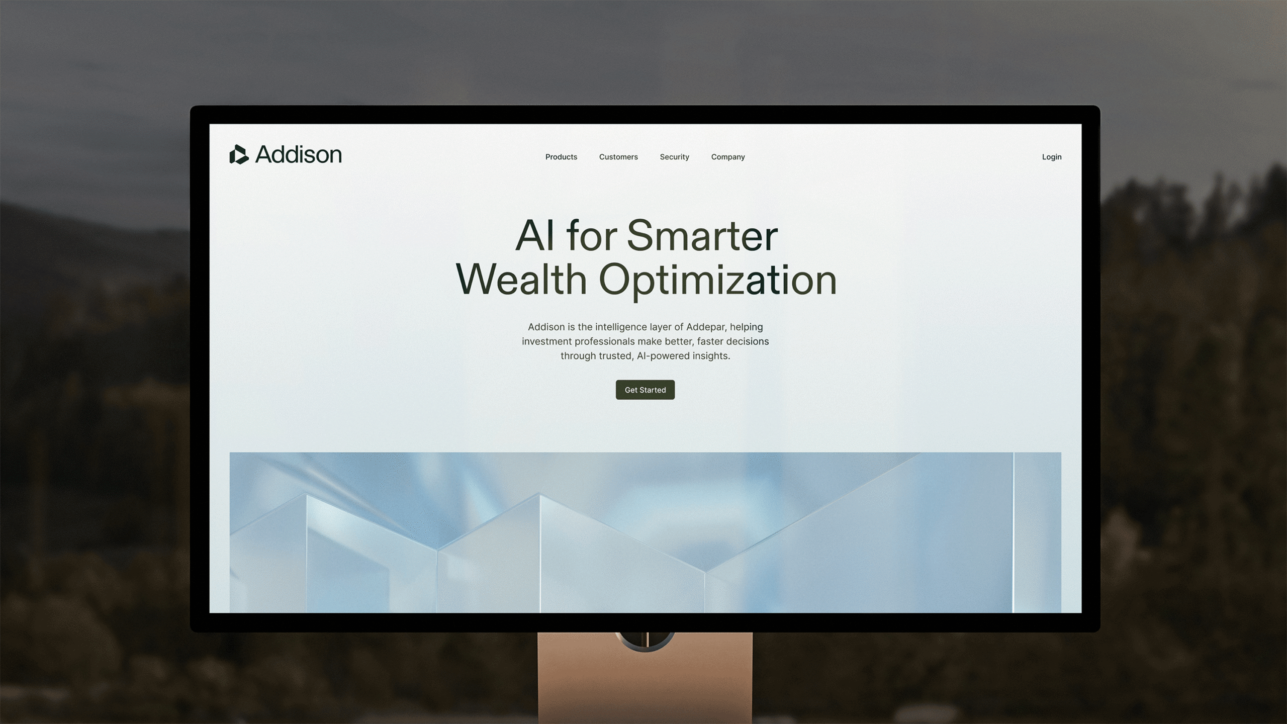
Intelligence, expressed through clarity. Photography blends human presence with ambient technology, placing Addison in the real environments where investment work actually happens — not a sterile product demo, but a living, breathing workflow. Motion follows the same principle: smooth, intentional transitions that surface insight the way Addison does, never jarring, always guided.
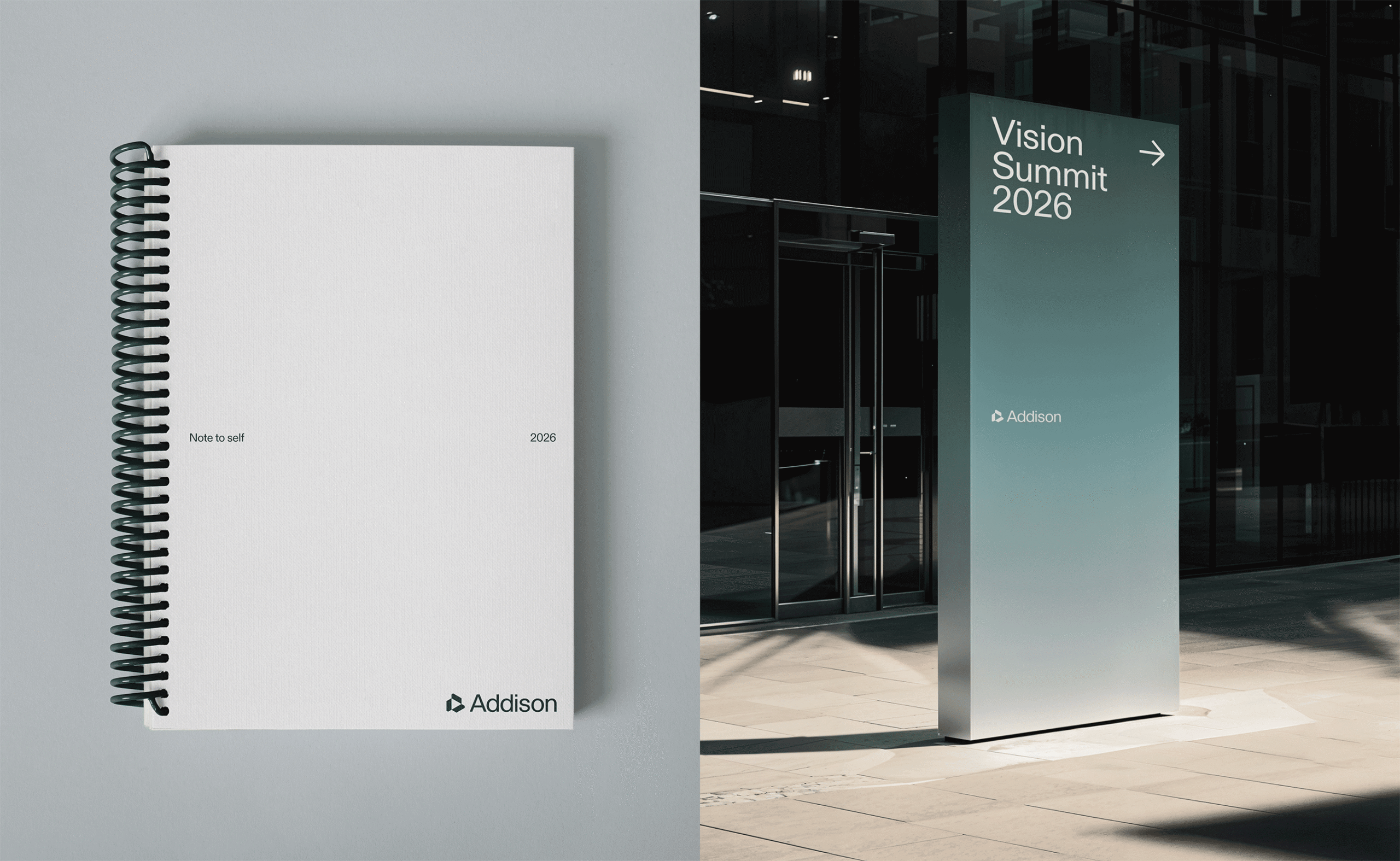
Layouts are spacious and editorial, built around legibility and context. Accent colors carry data visualization and interaction states without competing for attention. Whether on web, in product, on screen, or in print, every touchpoint reinforces the same idea: Addison isn't here to replace human expertise. It's here to make it sharper.
Collaboration at its finest
Special thanks to the Addepar/Addison team:
Angel Ng, Principal Product Designer
Katie Mentus, Vice President, Head of User Experience and Design
Kristy Ryder, Creative Design Manager
Madison Keating, Staff Content Designer
Sam Jenkins, Staff Product Designer
Ben Thayer, Staff Product Designer
Steven Lamb, Head of Product Innovation
Amy Zhang, Senior Product Manager
Himanshu Saraswat, Engineering Manager