Brand identity
Art direction
Motion design
ToV & Messaging
Brand guidelines
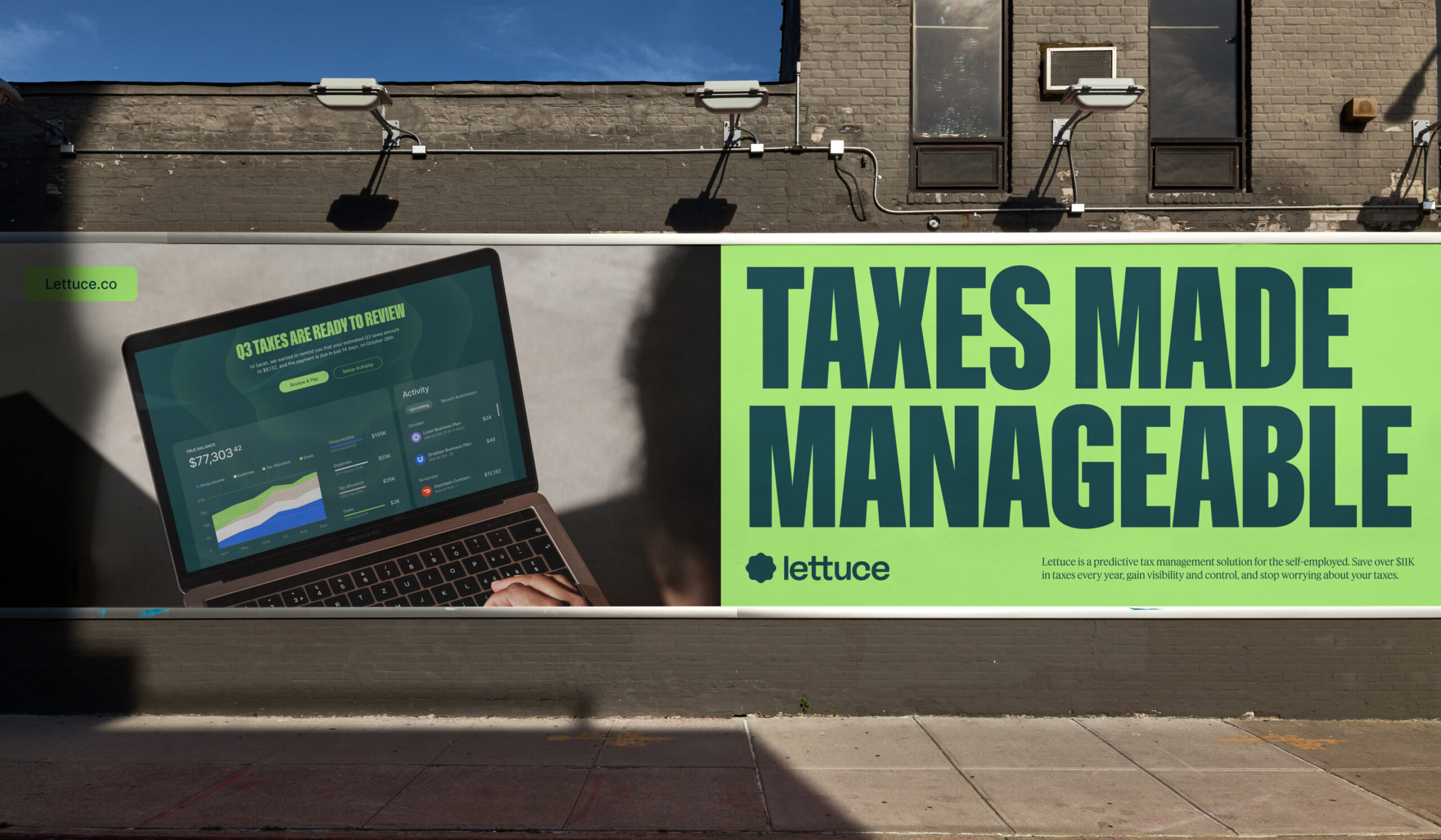
Lettuce
Lettuce was founded to solve a simple problem: Solopreneurs overpay their taxes. These businesses-of-one who make up 80% of small businesses in the U.S. are too busy to stop and worry about their taxes. Lettuce is an AI-powered automated tax management service that helps them save their hard-earned money as well as time and stress.
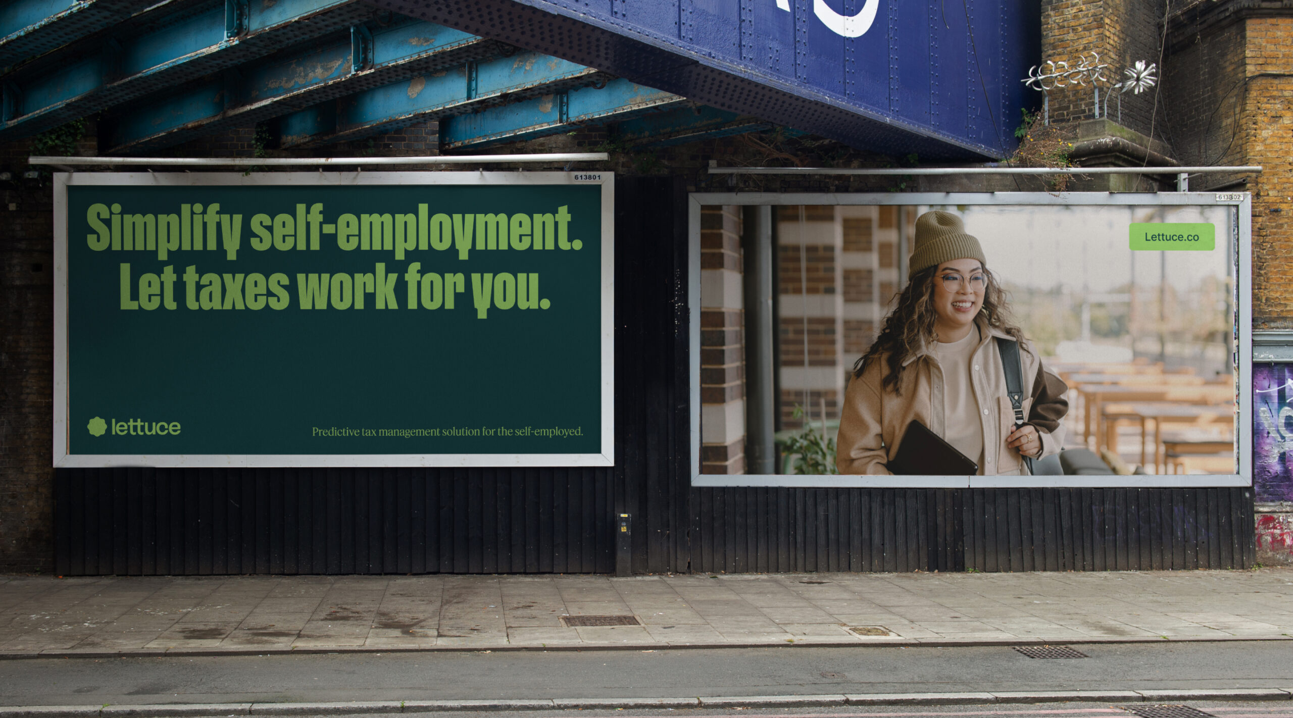
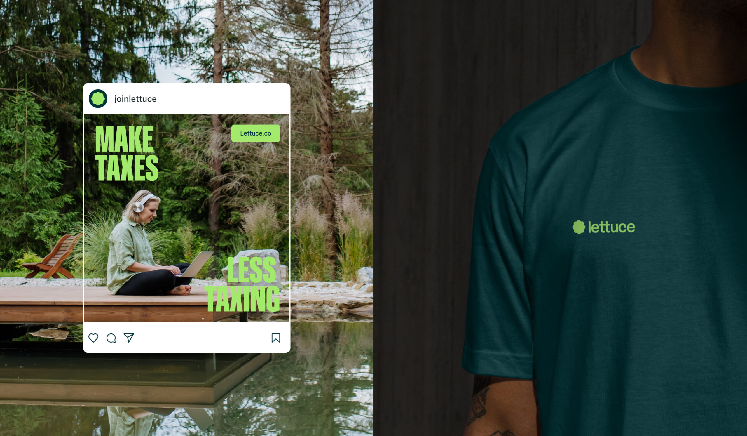
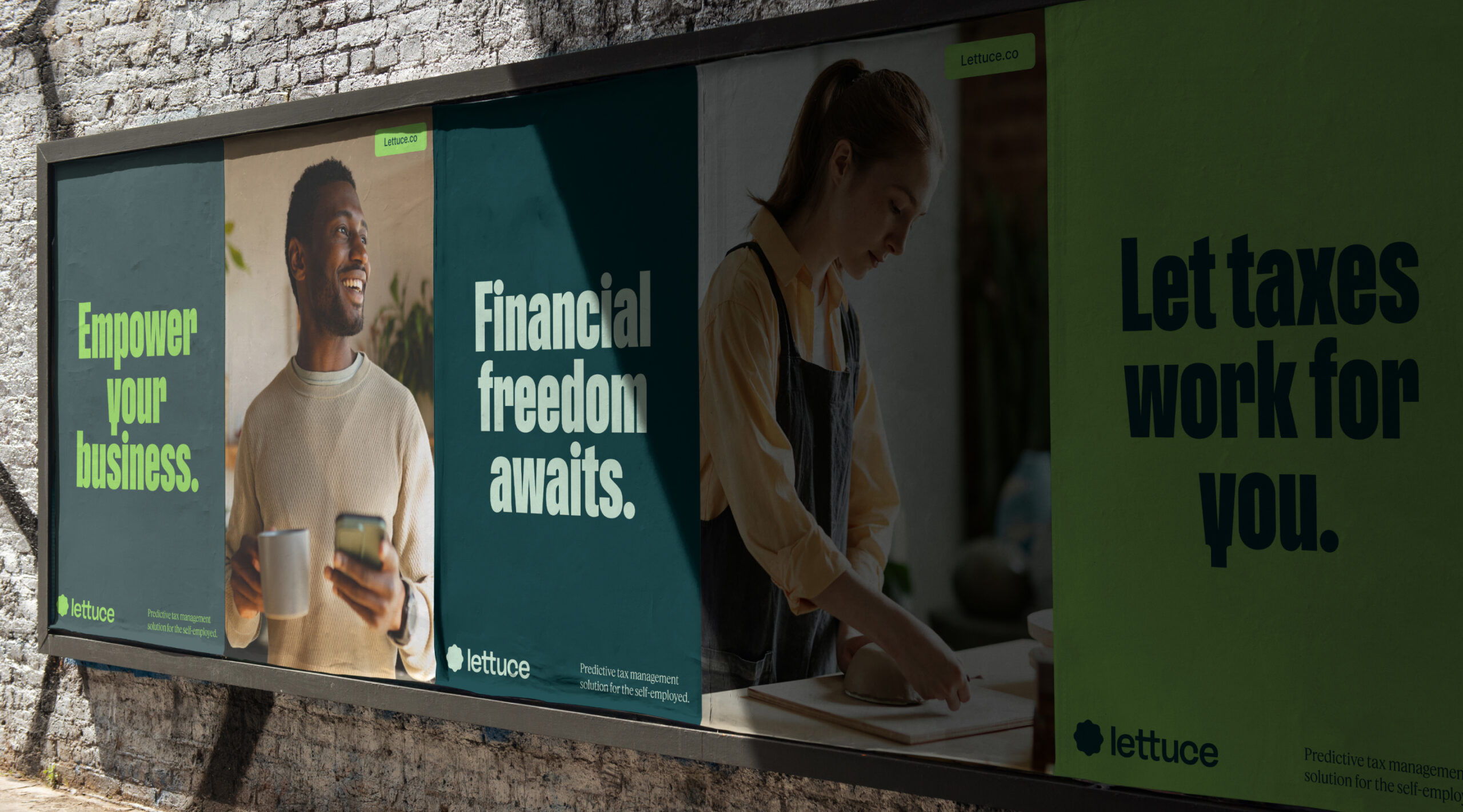
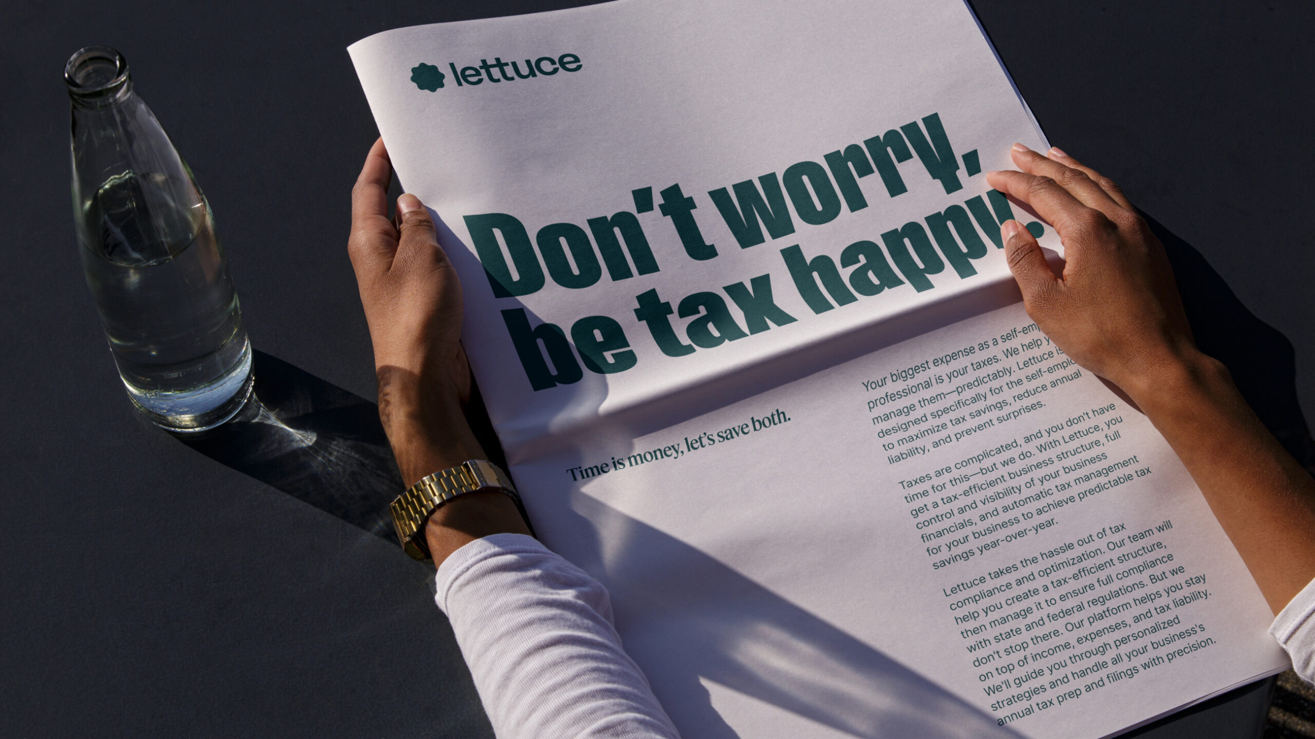
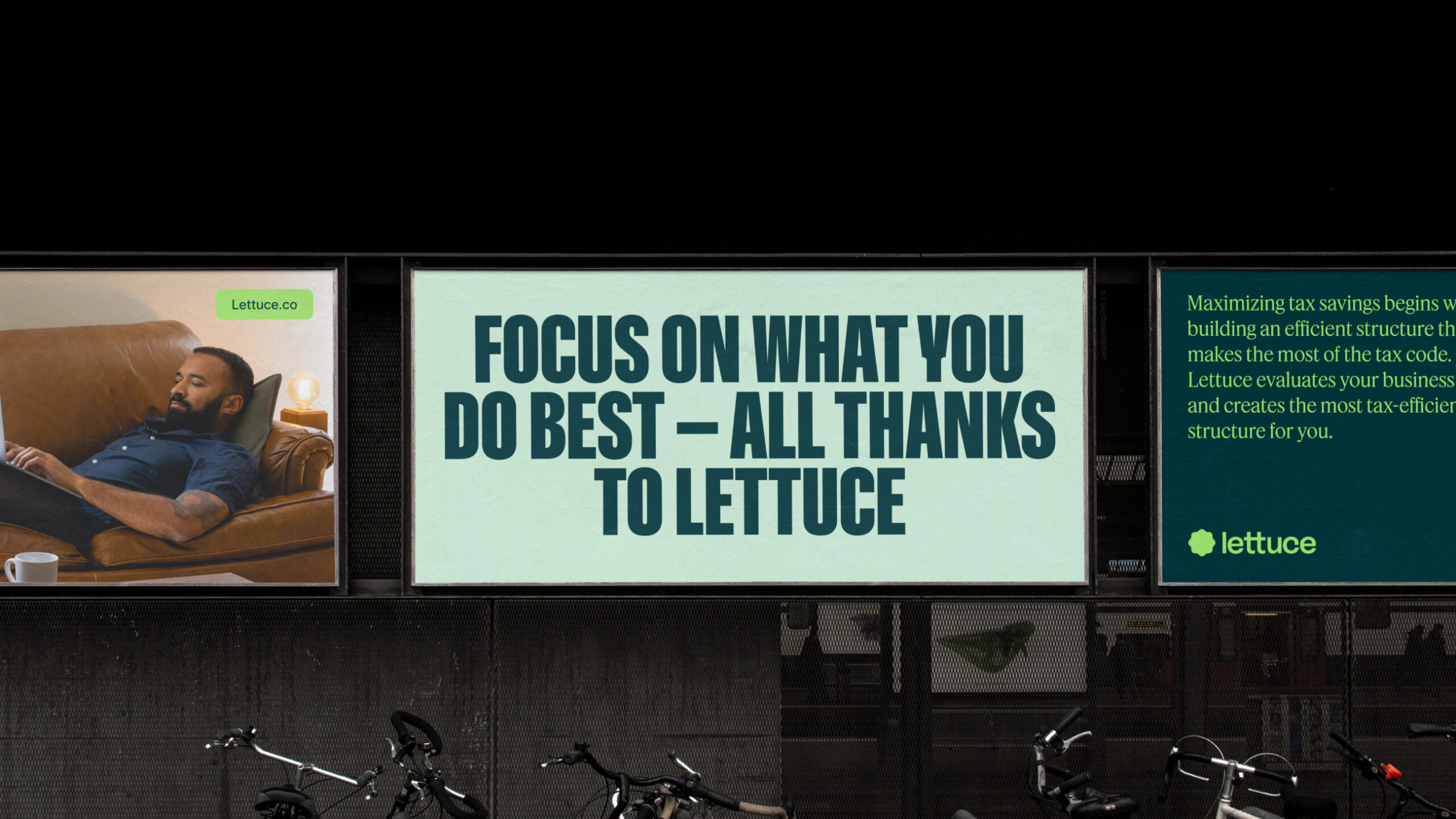
Given how much this audience dreads taxes, Lettuce came to us with a meaty challenge: create a likable brand in an unlikable category. CōLab delivered an approach that is sleek, yet inviting, fusing modernity and approachability to make business taxes feel less daunting. Through a fresh and dynamic visual palette and bold and distinctive elements, the Lettuce brand symbolizes the flourishing growth that solopreneurs everywhere aspire to.
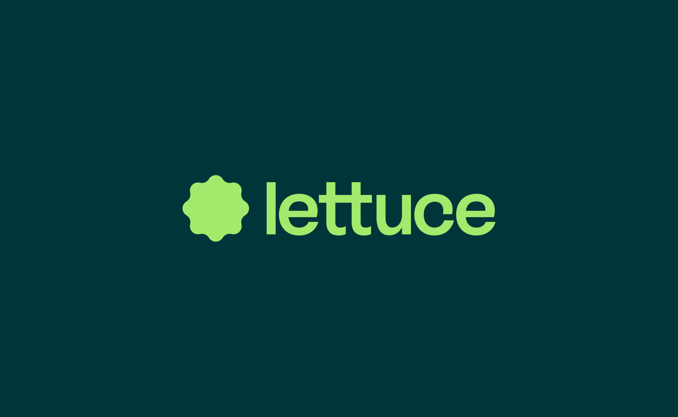
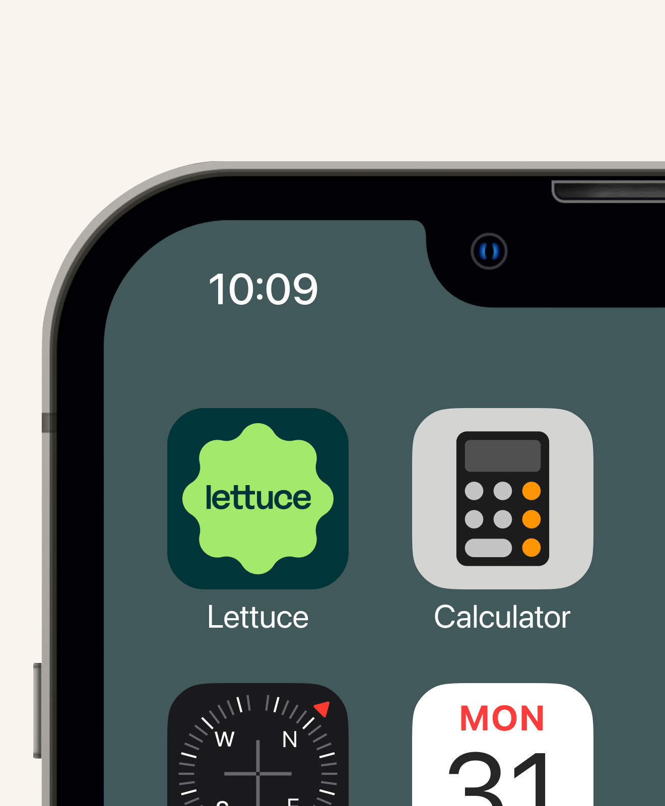
Logo
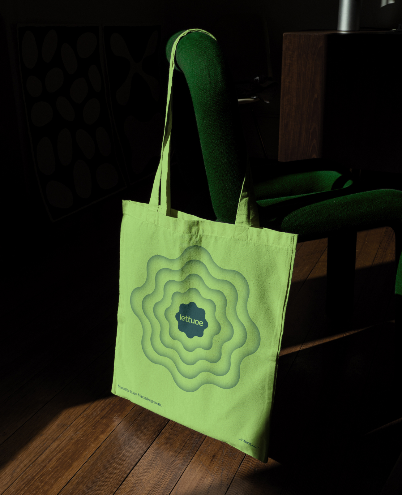
Lettuce's logo shape symbolizes the financial journey from seed to harvest. It represents the early stages of simplicity and organization (seed stage) and signifies the potential for growth and development (growth stage). The logo's symmetry offers balance and stability, making Lettuce a dependable partner in the complex world of tax management, ensuring financial order and the opportunity for growth (harvest stage).
Motion
Motion design principles are like the foundation of visual storytelling, akin to Lettuce's emblem embodying growth and precision. The strategic use of color in motion design breathes life into the story, analogous to the fresh spectrum of lettuce hues. Varying shades or intensities of a single color play a crucial role, symbolizing data values with darker shades for lower values and lighter shades for higher values, accentuating the dynamic potential for growth in the visual journey.
The symmetrical and balanced composition in motion design guides viewers through complexity, encouraging engagement and comprehension. Motion serves as a reliable tool for clear communication in an information-saturated world.

Brand voice and messaging
We wrote the Lettuce brand to be a reprieve from the stress and anxiety that taxes can trigger. We thought of the voice as a Friendly Tax Coach with a Ted Lasso-like unflappable optimism. We strove to be simple, inviting, and empowering throughout, with just enough cleverness to reassure users of our deep tax expertise. Paired with the visual design, the voice becomes refreshingly direct and clear in a category full of jargon and complexity.

Collaboration at its finest
Special thanks to the Lettuce team:
Ran Harpaz: CEO
Gabrielle Tenaglia: Head of Marketing
Kate Faux: Brand Marketing
Ambika Nigam: Head of Product
Christina Nizar: Product & Design Lead
CōLab team: Jason Mamaril, Brian Wakabayashi, Salih Abdul-Karim, Kyle Macy, Yu Rong, Veronica Maldonado, Michelle Ha